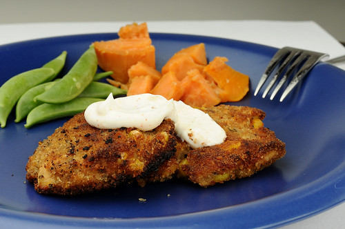
I loosely followed a weight watchers recipe for crab cakes but put my own twist on it, salmon croquettes and the Hot peppered sour cream sauce was the perfect touch.
Delicious.

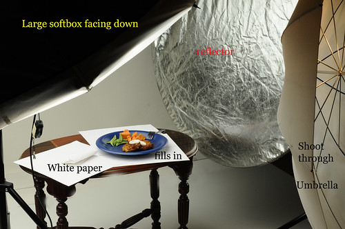
and my friend Elli asked about my lighting on yesterdays images. I thought it would be easier to take a picture of the set up instead of trying to explain.

Aticles read: Understanding Exposure Value in photography by Picture Correct
Read and trying to understand this (Wikipedia-Exposure Value Chart) made me feel like I was in a math class.
Images Viewed: Jeanetteleblanc

5 comments:
Looks quite decadent!
If there is one thing I don't like about this it would have to be the edge of paper visible in the upper right of the frame. I am very nitpicky about things like that, so I wouldn't expect anyone else to pay attention to it.
Other than that, very nice work on the lighting, and thanks for the picture of the setup.
Looks yummy..and thanks for the plug ;)
Nice work! I think your lighting looks great. The only thing I would change is the same thing Nikhil said - the line of your paper/backdrop. What I do to minimize that is either use one solid sheet of paper as both the bottom and the backdrop (such as studio backdrop paper) or, in a pinch, I push my bottom piece (for me it's white posterboard) right up against the white background. That often leaves me with two different whites though, so I only use that when I have to.
Great work! Looks yummy!
Looks yummy!
Post a Comment