I have a far way to go yet, but I must say that I went from totally hating this program to absolutely loving it.
So I've decided that anytime someone wants to know how I did something I would take the time to show them. Here is my first request. Thanks Tess.
Here is the original picture. There's nothing spectacular about this image except this: My Viking man, who is a mega talented photographer (his style is a bit on the dark side see here: Shuttertonin)
has been challenging me to learn the "camera numbers" without looking at the camera meter. For example, he'd say, "look at that bridge, what do you think the setting would be? Don't look at the meter" I'd spit out a number like, F4.5 at SS500" He'd say "I think that's gonna be to dark/light but try it"
THAT'S CORRECT my friends, Viking man doesn't need the camera meter. He can look at a scene and decide what kind of "feel" he wants and take the picture. Portraits are not his "thing."
O.K. so I got a bit distracted. Here is the bridge on that sunny afternoon.
1.
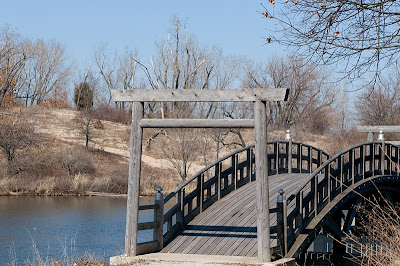
My software is Photoshop Elements 7, but I've heard that you can do bigger and better things in full versions of Photoshop.
I opened filter>Render>Lighting effects>
Light type chose omni.
At this point you can move your circle of light by putting your arrow in the center of the circle and drag it where you want it to be.
Just so you can see what it looks like so far.
2.
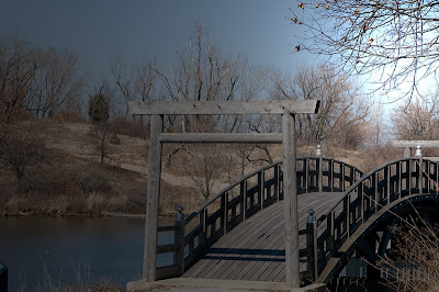
The default color is white but you can click on the first white box to change the color. I've chosen a very light blue.
Move the intensity slider around until you have the look you want. Mine was set at intensity 45.
Under properties I've selected a black box, Ambient light of 29.
There is a preview box that allows you to see what changes are going on in the image. Just play and have fun.
3.
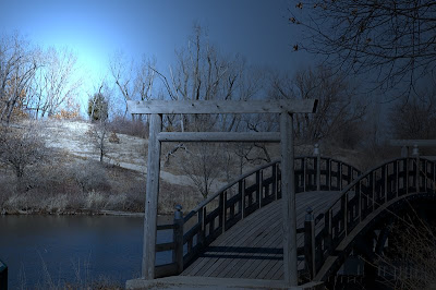
Click o.k.
Now to make it appear more "believable" I went back to Filter>Render>lighting effects>
I changed the light type to Spotlight> pick a color close to the one you selected the first time. Again I chose a very light blue. Use your arrow to move the direction of the light. Intensity I chose 71, Ambience 14.
I decided to use the shadows created by the sunlight in my favor this time.
4.
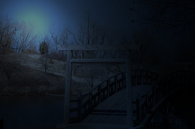
This is my first tutorial if you have any suggestions/question feel free to drop me a line. If you decide to try this technique link up so that I can see it.
My Picture of the day:
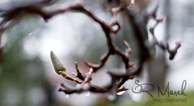
My neighbors Cherry Blossom Tree. I love that thing. I take pictures of it year round. I thought it was interesting today as the tree struggles to prepare to bud there is snow and ice on it's branches. Yes, it snowed today.

3 comments:
nice lighting effects. And I like the tree bud too.
That paper is called tulip, and I didn't light it at all. I got the darker band at the bottom, just because of the light fall off, I guess. I don't actually care for that, as it made taking out the plexi line difficult....wasn't sure if I'd like the color, but I think I do, for spring, and seniors. Thanks for looking! Have a great week!
wow how program can do for pictures to be complete nicely.
Cool pix of tree bud!
bring on warm weather.. We all need that
Nice work! Thanks for taking the time to share your steps!
Post a Comment