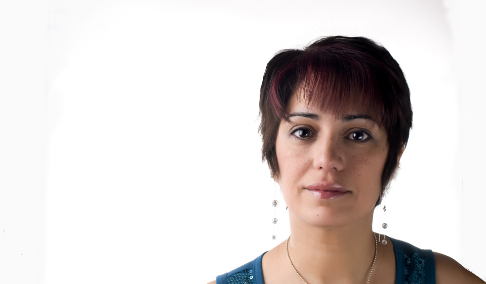
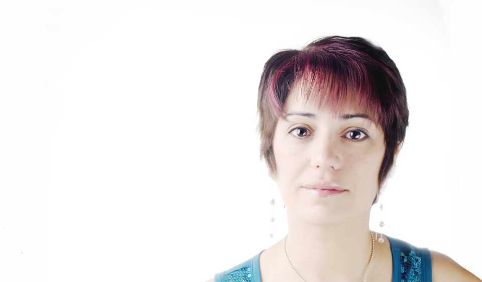
Read Tasra's blog and be inspired. Here: Tasra 365 I mean the whole purpose of the 365 was to learn and share and be better photographers right?
Just in case we are needing more inspiration. Yes I signed the dotted lines.
And so for today's post. I really like the high key (#2)my family likes the other one. What's your vote? Please tell me which one you prefer?

or

It is not easy to find happiness in ourselves, and it is not possible to find it elsewhere. ~Agnes Repplier
Think positively about yourself.... ask God who made you to keep on remaking you. ~Norman Vincent Peale
and I posted those 2 quotes because I found so many flaws in myself that I finally had to let go and just be happy. p.s. I love portraiture!
Technical stuff
Location - Home studio
Camera - Nikon D-300
Lens - Nikon 50 mm
ISO - 200
SS - 125
Aperture - F-8
The backdrop was metered at F-11
Large softbox camera right and reflector on subject camera left.
Reason for this image - Need an updated picture for Blog Header.
. . .by the way I met my running goal for the week. This week I logged 15.5 miles.

5 comments:
Liked both pictures.. off to check both blogs.
Can't wait to see what you do with pix for the header.
I like aspects of both, actually. You're beautiful in both of them!! Thanks for those blog links - I can't wait to check them out!
Sandra,
They are both nice. I like 1 because I can see you better and your skin tone is great. 2 is cool too. All you need to do is add some black and vibrance in your RAW manipulation. That will make that one perfect too.
Love you... Tia
Looking great in both Sandra but my vote would go to the second pic!
I vote for number 2. Number 1 looks more like a typical snapshot to me, while number 2 was striving for a more interesting effect which it achieved. Great work, and thank for the shout out.
Post a Comment